- Renaming the columns in your table.
- Showing and hiding the columns in your table.
- Showing and hiding the table name from the column labels.
- Showing and hiding the totals for your columns.
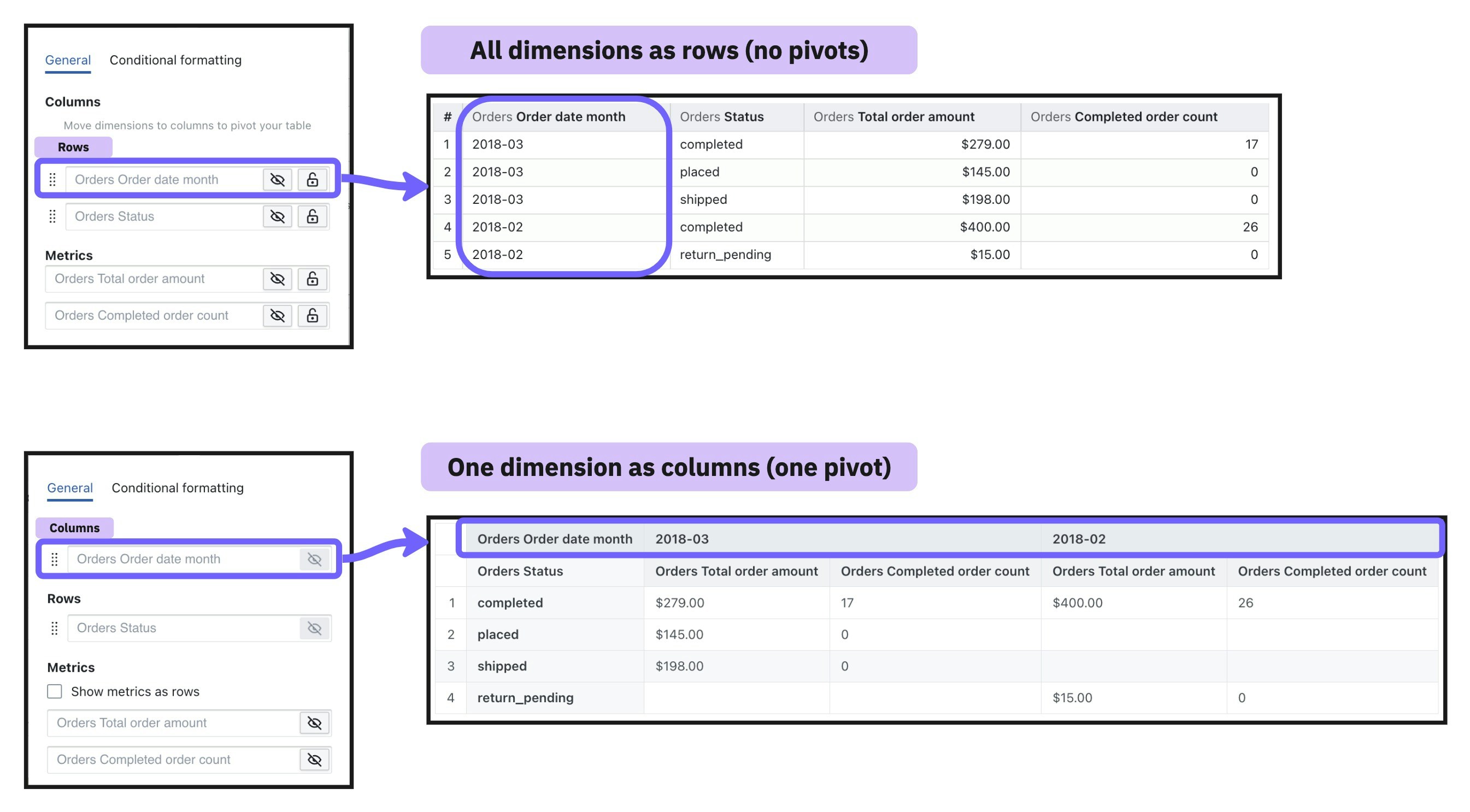
- Pivoting by a column.
- Transposing your table (a.k.a. pivoting your metrics)
- Locking a column from scrolling in your table.
- Adding conditional formatting to your cells.
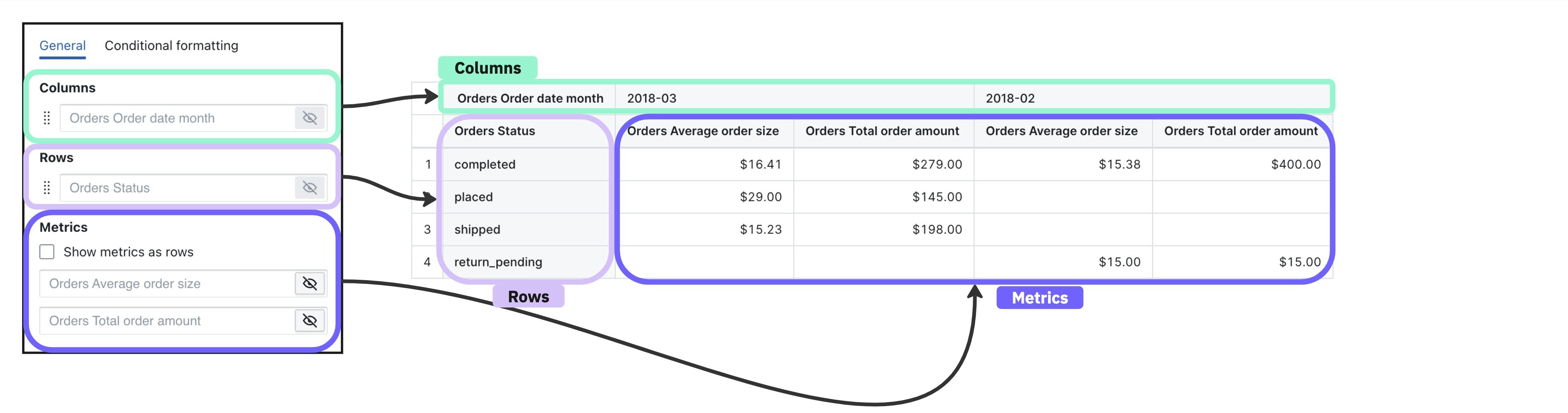
Columns, rows, and metrics
Table visualizations have three components:- Rows: When a field is chosen for the row area, all of the unique values for that field are populated as values in the rows of your table.
- Columns: When a field is chosen for the column area, all of the unique values for that field are populated as values in the columns of your table.
- Metrics: If you have metrics in your table, then each metric cell shows the summarized information for a given row + column combination.
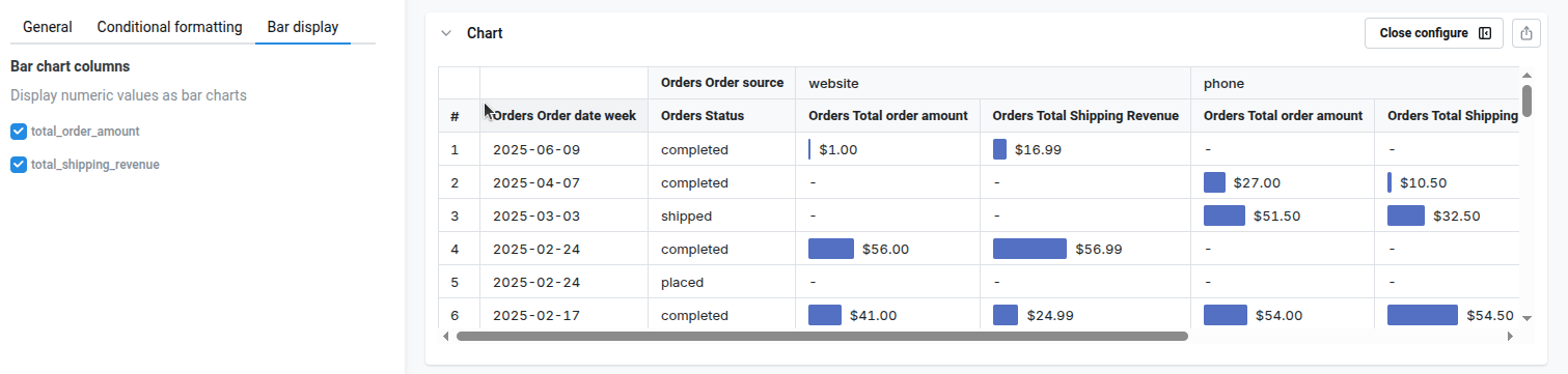
Adding tiny bars to table visualization
You can also enable tiny bars on each table cell, to improve visual feedback. To configure this, go tobar display on the sidebar, and select the numeric columns. We’ll calculate the min/max values , and we will display a tiny bar next to the value on the table
Pivot tables
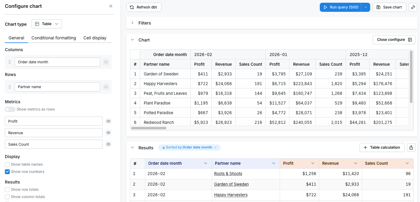
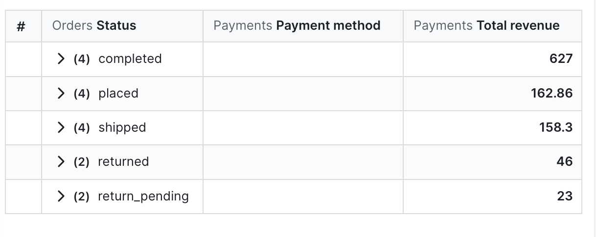
Pivot tables allow you to summarize larger sets of data in table visualizations by moving row values into columns. They’re also helpful to identify trends between two dimensions in your data using a table visualization. To add a pivot in your table, move a dimension to thecolumn section of your table configuration. This will change the dimension from having its values populate the rows values of your table, to having it populate the column values of your table.
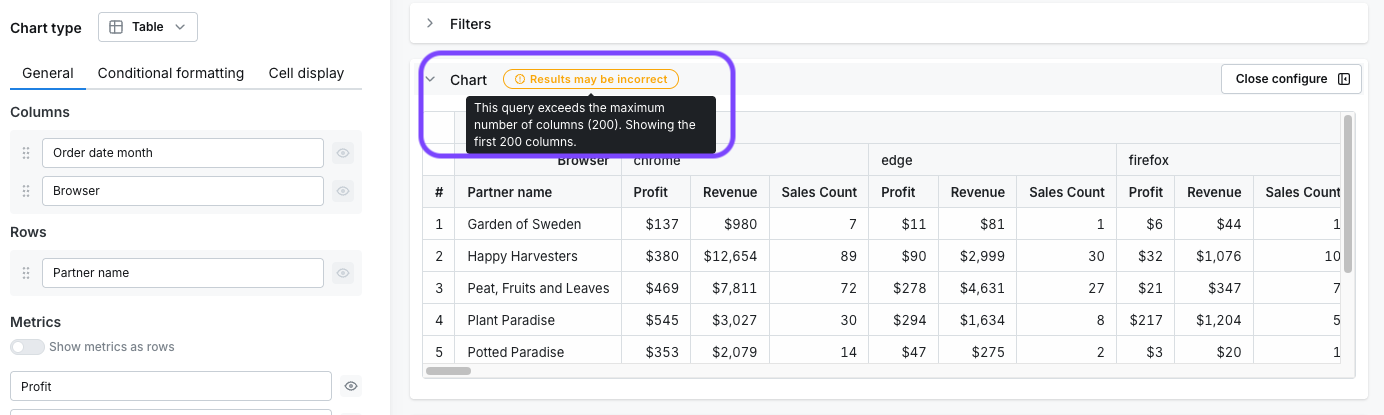
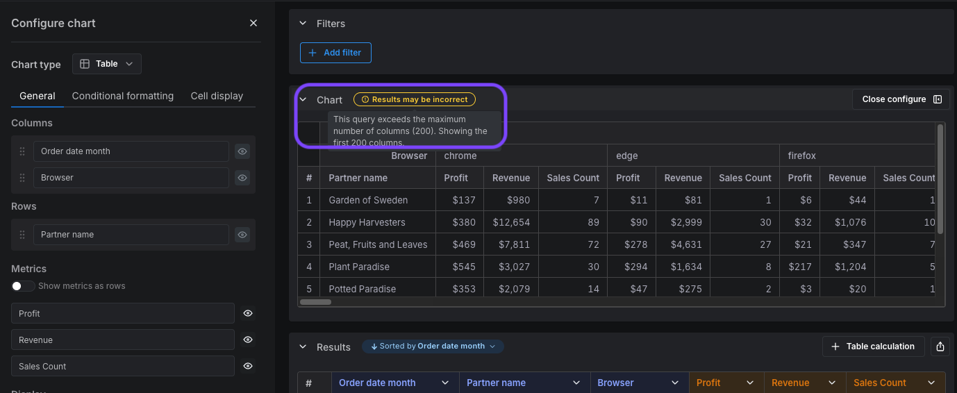
Column limits
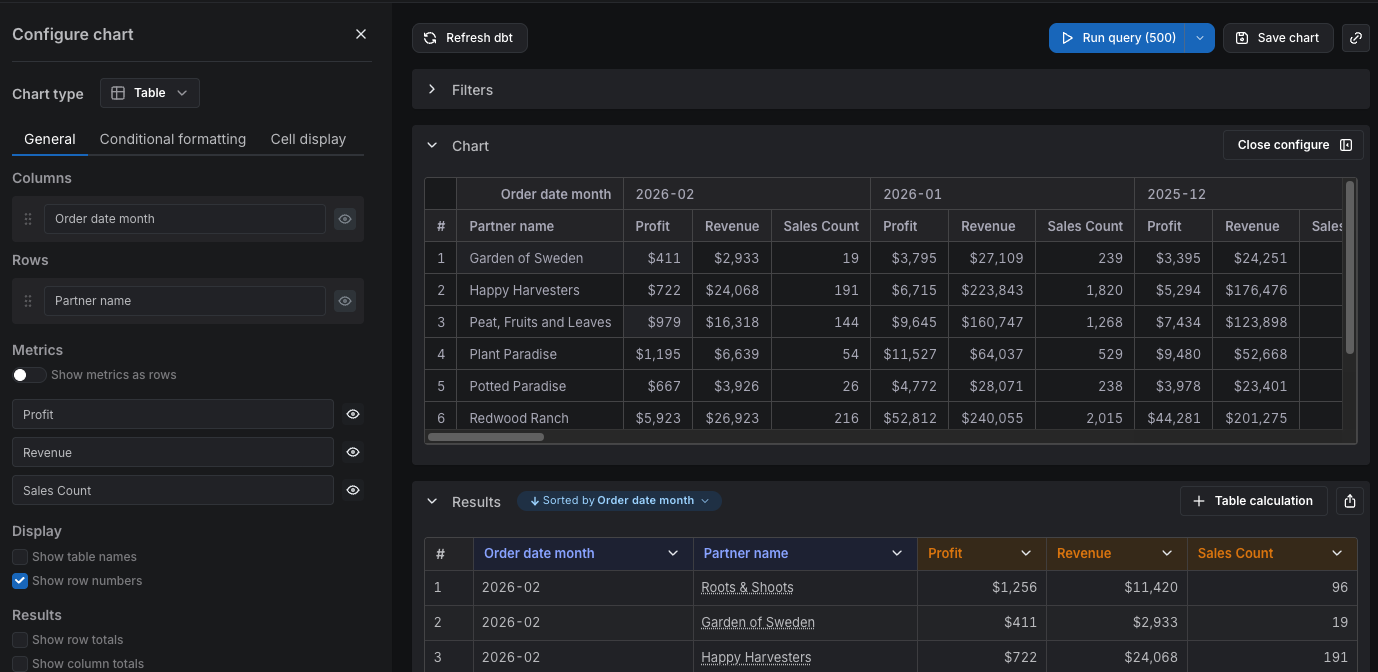
Pivot tables have a default limit of 200 columns to ensure good performance. Large pivot tables with many columns can significantly slow down query execution and rendering times, so this limit helps keep your dashboards responsive. The column limit works differently depending on whether you have metrics as rows or metrics as columns:When metrics are columns (default)
When metrics are displayed as columns (the default behavior), each pivoted dimension value creates a column for every metric. This means the total number of columns equals the number of unique dimension values multiplied by the number of metrics. For example, if you pivot byorder_date_month (with 36 months of data) and have 3 metrics:
- Total columns: 36 months × 3 metrics = 108 columns which is within the column limit of 200
- Maximum dimension values:
floor(200 / 3)= 66 months
order_date_month pivoted to columns and 3 metrics:
order_date_month and browser (with 6 distinct values) and have 3 metrics, the maximum number of months displayed is:
- Maximum dimension values:
floor(200 / (6*3))= 11 months
- filter your data, e.g., filter your months to only show data from the last year
- reduce the number of dimensions you are pivoting on, e.g., decide whether splitting your data by both
order_date_monthandbrowseris necessary - reduce the granularity of your pivot dimensions, e.g., pivot by
order_date_yearinstead oforder_date_month - show metrics as rows instead of columns (see below)
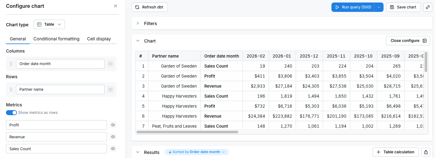
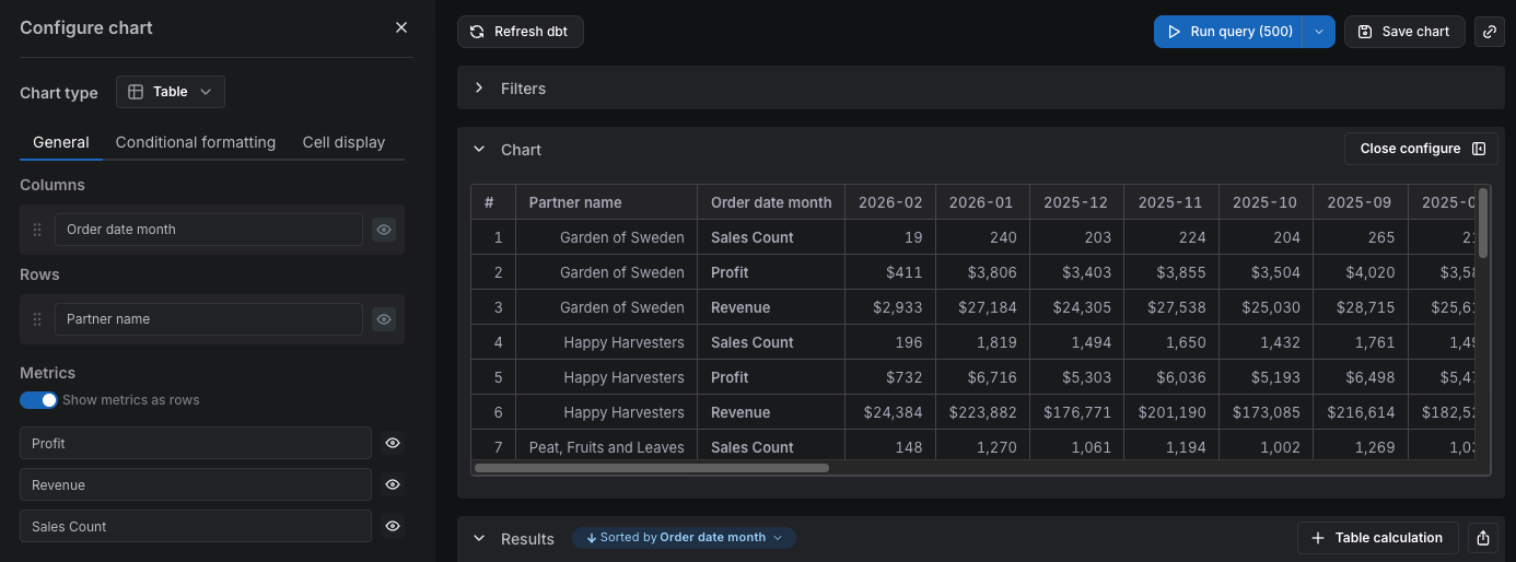
When metrics are rows
When you enable Show metrics as rows, each pivoted dimension value creates only one column, regardless of how many metrics you have. The metrics are displayed as separate rows instead. For example, if you havepartner_name as a row dimension (with 5 partners), pivot by order_date_month (with 12 months of data), and have 3 metrics:
- Total columns: 12 (one per month)
- Each row is repeated once per metric — so you’ll see 5 × 3 = 15 rows
partner_name:
Totals
You can add column totals or row totals (in pivot tables) to your tables by selectingShow column totals or Show row totals in the chart configuration panel. The column totals in your results and table visualizations are calculated using the underlying data from your table, not only the values that are visible in the table.
Totals are not calculated for table calculations. Also, in pivot tables, totals are only shown for
count and sum metric types.Incorrect totals
Why are my totals lower? When using thecount_distinct metric type, you can sometimes get totals that are smaller than if you sum up the values seen in the table.
For example, if you count the distinct number of devices that viewed pages on our website each month, it would look something like this:
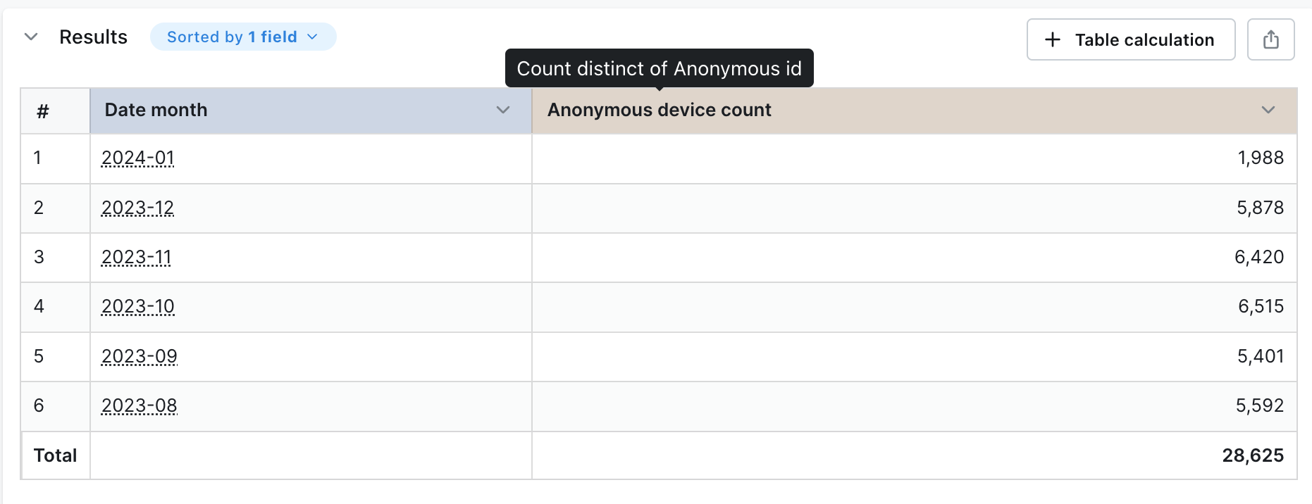
Anonymous device count column, the value you get is much higher than the total shown in the table. This is because the same device can view pages on our website across many months. So, when you add up the values in the table, you’ll be counting some devices more than once.
Lightdash uses a SQL query to calculate the distinct number of devices across all of the months so we avoid double-counting devices.
Why are my totals higher?
There are two reasons why this could be happening:
- You’ve set a row limit in your query that’s truncating the results. If the number of possible results from your query is larger than the row limit you’ve set, Lightdash will calculate the totals using all of the results (including the rows that have been removed from your table because of the limit).
- You’re using metric or table calculation filters. When you use metric or table calculation filters, the totals are calculated before the filters are applied.
This calculation isn’t a “true” total when you’re using metrics types that are
count_distinct!Subtotals
You can add subtotals to your tables by selectingShow subtotals in the chart configuration panel.
Freeze columns
If you have a wide table, you may want some columns to be locked to the left while you’re scrolling. Click on the lock icon beside the column(s) you want to keep pinned to the left of your table visualization to lock them in place.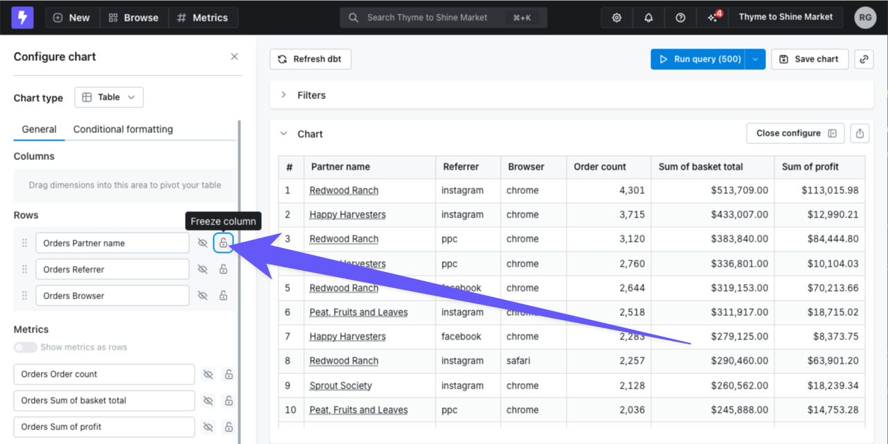
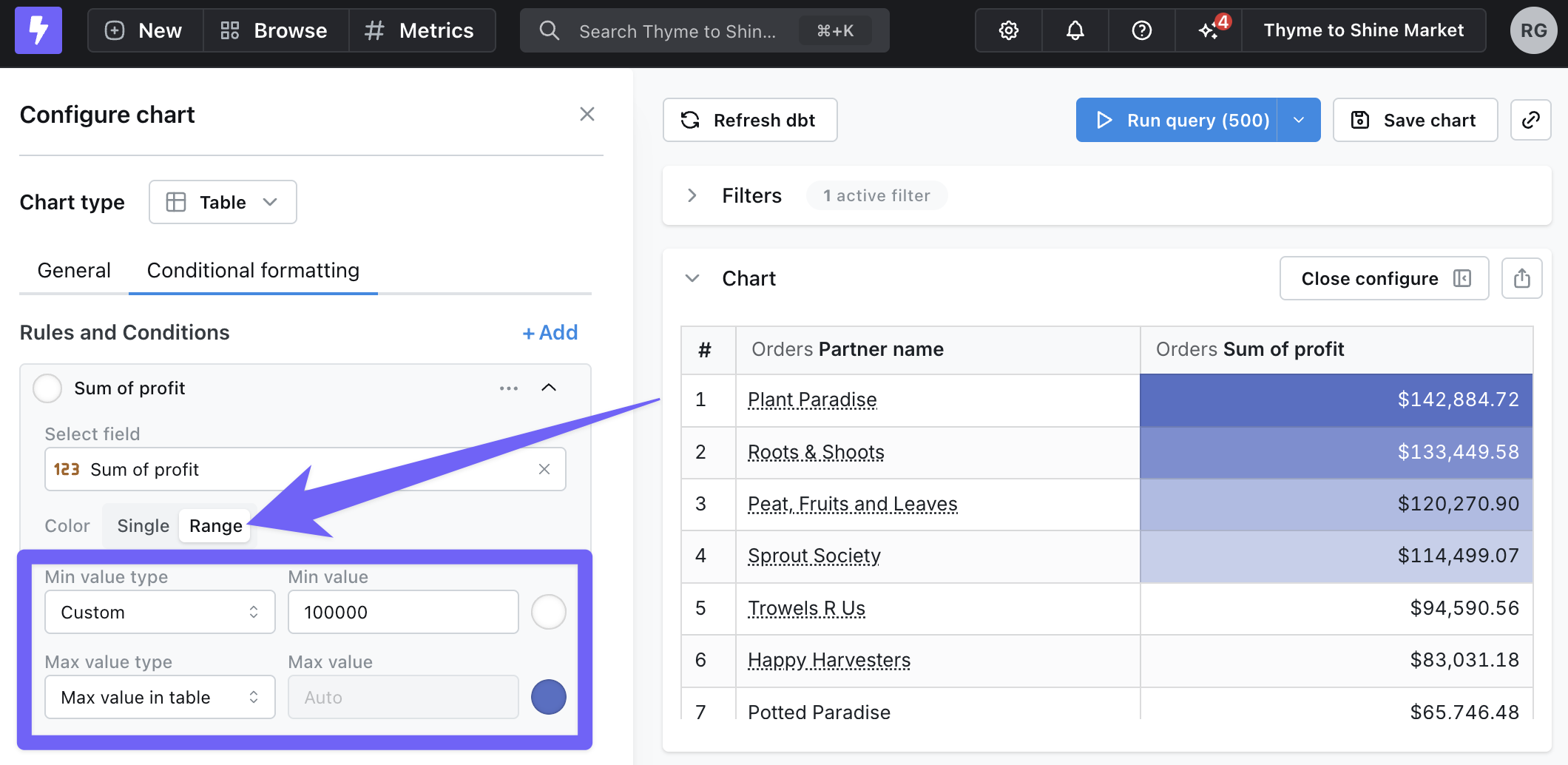
Conditional formatting
Sometimes it’s helpful to highlight certain values in your tables when they meet a specific condition. You can set up conditional formatting rules by going to the Configure tab, then Conditional Formatting.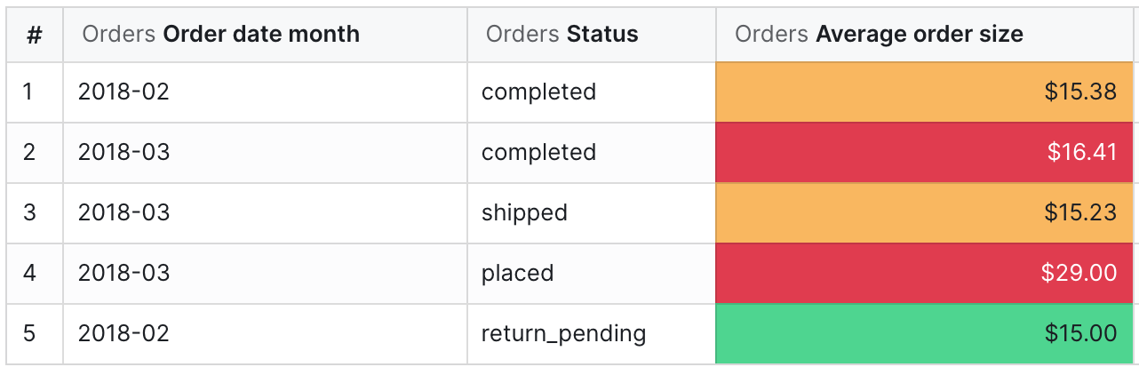
Highlighting cells
When you add a new rule, you’ll first need to pick which column should be highlighted and the type of rule you’d like to apply (Single or Range). There are three ways to compare data for each role:- Values compares the chosen field to manual input values.
- For example, color the
Profitcolumn red when a row is less than $10,000
- Field compares the chosen field to another field in your results.
- For example, color the
Revenuecolumn green when it is greater than theTarget revenuecolumn.
- Field values compares another field in your results to manual input values, then formats your chosen field.
- For example, color the
Partner namecolumn orange when theTotal orderscolumn is greater than 1,000.
Color ranges
To use color ranges for your rules, select Range under Conditional Formatting. You can choose specific minimum and maximum values, or you can automatically set them based on the values in your results.